So we ran a little test to see what happens if you let AI throw together an interface, no designer helping it, and then put that next to a screen made by an actual designer.
The task
Design a clean, modern iOS home screen for an app called TechGear, an online store that sells computers and gaming equipment.
The rules
We kept things fair. Both had the same setup. One prompt each, nothing more. No retries, no going back to fix mistakes. Ten minutes on the clock, and whatever you had by then was final.
The exact prompt
Here’s the task both AI and the designer worked with, word for word:
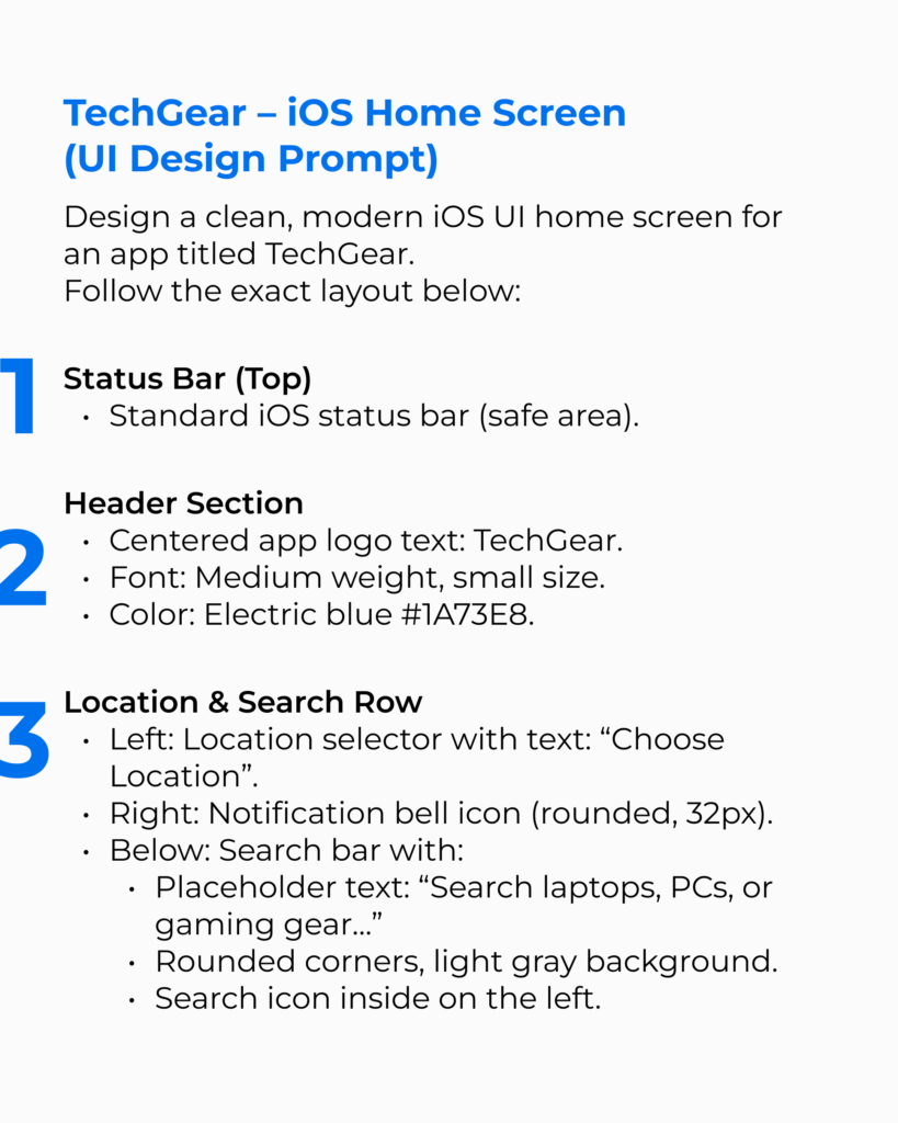
Both sides got the exact same instructions. The prompt wasn’t fluffy at all. It didn’t say “make it pretty.” It spelled things out like a checklist: status bar here, search field there, accent color, product cards. Every block is pinned down.
That level of detail matters. For the AI, that kind of prompt is perfect, as it loves step-by-step instructions. For a human, it’s messier. You don’t just copy the script and call it done. You’re juggling hierarchy, typography, spacing, all those small details that decide if the screen feels natural or awkward. Same text, two completely different headaches.
Final works
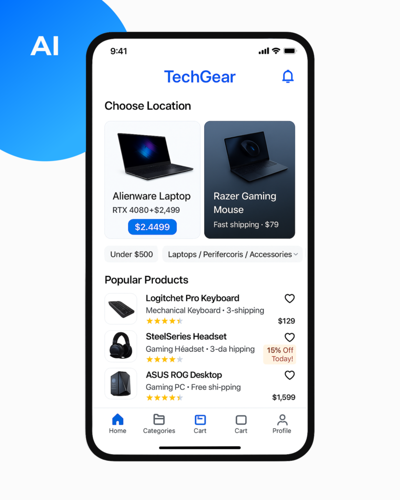
The only thing AI didn’t mess up
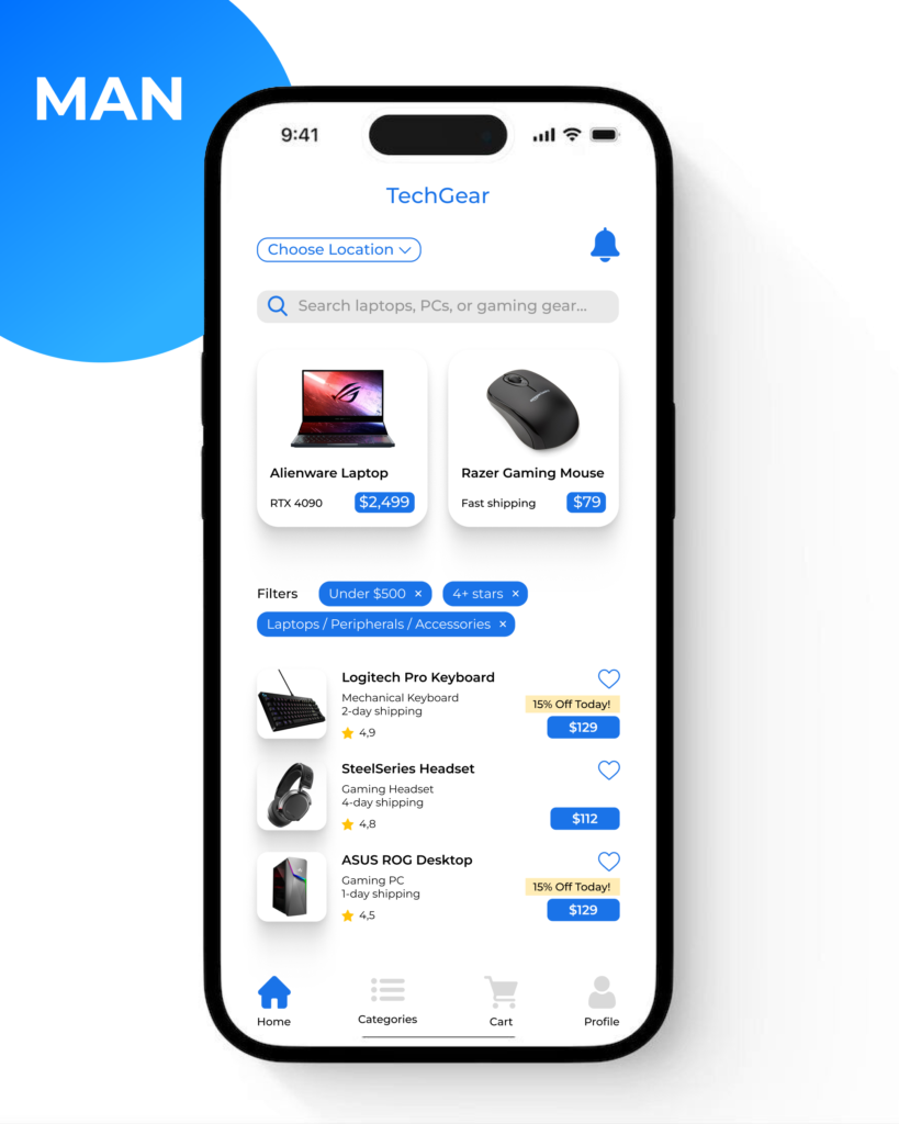
Both got the status bar right – standard iOS bar with time, signal, battery, all where they should be.
Who nailed the header, and who made it loud
For the header, both designs placed the TechGear logo in the center and used the electric blue specified in the prompt. But the font weight and size feel slightly off in the AI design, too heavy for the space it occupies, as if it is trying too hard to be important. It commands attention like a title slide, not a subtle app header. The human version, on the other hand, respects hierarchy. The header blends in without disappearing. It knows it’s not the star of the show, just the welcome mat.
Location & notification: present, but off
Both designs show a location and a bell for notifications. But the difference is in how they feel. The human version makes it interactive and treats them as functional parts of the UI. There is a dropdown icon next to “choose location”, and the spacing invites the user to tap. In the AI version, it’s just a static text. It’s there, yes, but it doesn’t do anything. Also, that bell icon is way too big and pulls your eye for no reason.
The search bar that vanished
The AI just forgot the search bar. Gone. And that’s strange, because the prompt spelled it out clearly. The human design puts it in, no problem. Rounded corners, soft gray background, little search icon on the left, placeholder text that actually makes sense. It doesn’t draw attention to itself, it just sits there like it belongs. That’s the difference. One screen misses a key piece, the other makes it feel obvious.
Featured product cards: close, but not quite
As for the featured products, both screens show two cards side by side, but again, only one gets the tone right. The human design displays clean images, proper shadowing, and correct typography. Subtitles are formatted precisely as the prompt described: model first, price second. AI’s design confuses it with odd spacing and inconsistent copy – RTX 4080 + $2,499, which looks like a backend variable rather than a proper product label. And the mouse card randomly includes a laptop image.
Filters: interactive chip vs static labels
Filters are where things start to tilt even more in favor of humans. The prompt didn’t just ask for dropdowns, it asked for a dropdown style. AI’s version doesn’t look tappable or clear. Design 2, in contrast, brings in real filter chips with icons and “x” buttons, hinting they can be removed.
One product list invites you in, but the other breaks
Both have the popular products list, but AI’s is visually messy. Wrong spelling, broken alignment, and a general sense of disarray. “Steel Series Headset” even comes without a price. The human version has everything correct: product name, shipping info, rating stars, price, all placed with intent. Even the promo badge appears in the right spot.
Two cart icons? Really?
For the nav bar, the AI version inexplicably includes two cart icons. One on the far right, and one just beside it. This isn’t just a small mistake. It’s a failure of logic. A designer wouldn’t miss that, and he didn’t. The human version, in contrast, follows the prompt exactly: one cart tab, one active home icon, evenly spaced and properly styled.
Emotional intelligence
The AI layout checks the boxes but that’s it. It lays out things because the prompt said to, and not because it understands how those things form experience. There’s no pacing, no tone, no personality. Just parts.
The human version, on the other hand, feels intentional. It’s not just right, it’s deliberate. You can tell where your eye should go. You know what’s tappable. Even the spacing creates a sense of calm. It’s not about decoration, it’s about emotional logic. The kind of logic that says: we know who you are, what you’re here for, and how not to waste your time. AI can’t replicate that. It sees patterns, but not context. It mimics design, but doesn’t speak to people.
Final verdict
Both screens came from the same prompt. One followed instructions. The other built a product. And that’s the difference. Design is more than a structure, it’s intent, hierarchy, tone, and care. AI can guess what goes where, but only a human can decide why. So, in this challenge, AI produced a layout, and the designer created an experience.